Raising the Villages - New Logo and Celebrating One Year
It takes a village to raise a child. That's the mission behind the Raising the Villages movement. The project creates welcoming communities in support of young children and their families to have the best start in life. Their focus is on The Early Years, Starting Strong – creating welcoming spaces to connect and belong.
I was thrilled when I was contacted by the committee to help create a symbol for their logo. The goal of the new logo was to capture three main concepts behind their movement.
the idea of the "child" getting the best start at life through welcoming communities and how "community" thrives on the love, curiosityand unique brilliance of every child.
the idea that as "treaty people" on the traditional and ancestral lands of the Mi'kmaq, this is about being guided by the indigenous wisdom and active reconciliation all our children deserve.
our communities efforts to become north star communities who have recognized and acted on providing welcoming spaces for our children to connect, belong, grow and teach us who they are.
Other themes that came up in our conversations were acknowledging the 4 different cultures involved - English, Acadian, Mi'kmaq and Gaelic, the land and water of our natural surroundings, gathering for our children, and the collective holding of the child.
Before
Some of the imagery being used by the group as they established themselves in their first year.
After
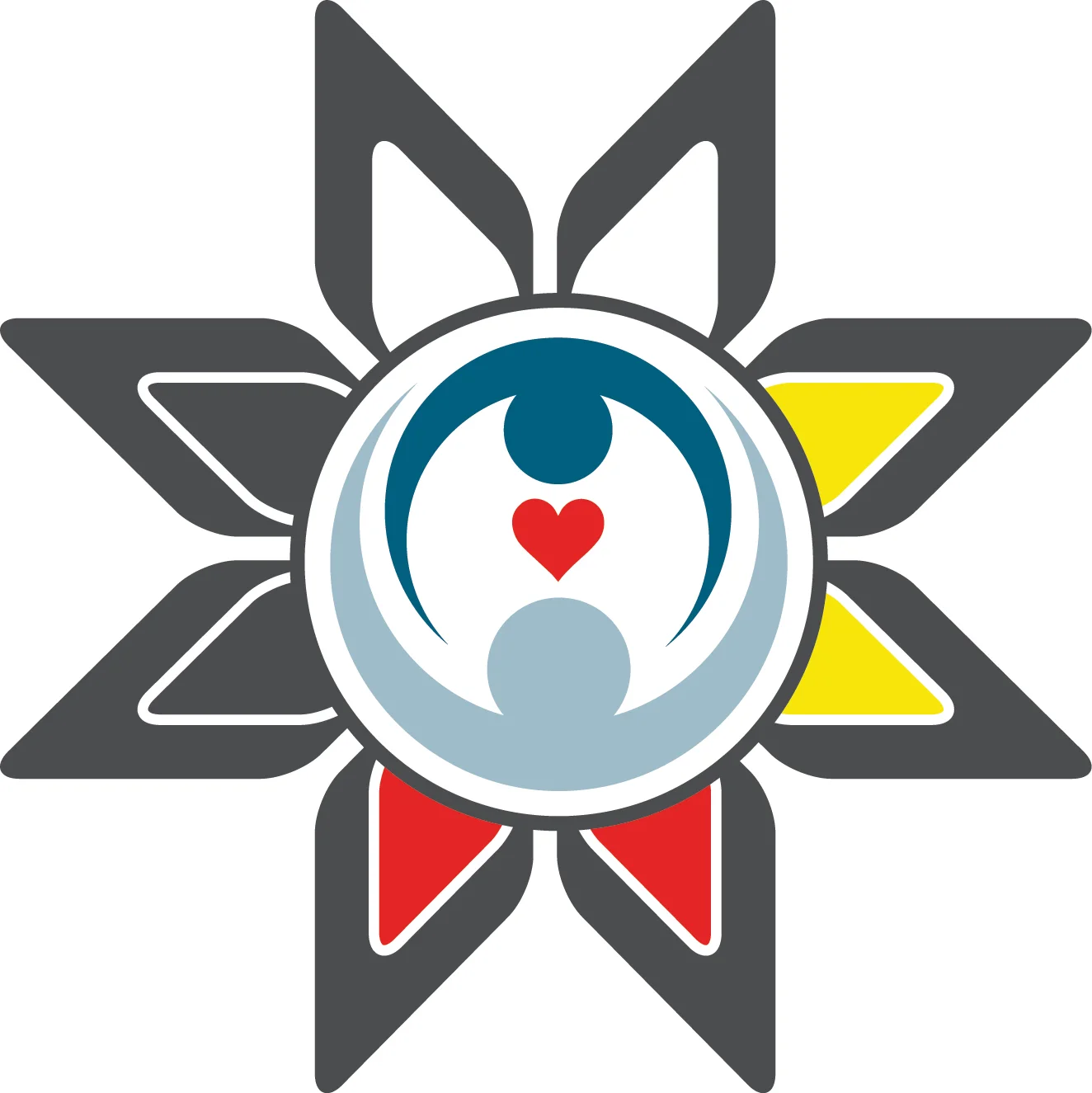
In celebration of their one-year anniversary they are sharing their new logo - a symbol I was honoured to create for them.
Earlier this month they had a terrific article in The Inverness Oran introducing their new look, the story behind the design and reflecting on their first year. An except on the design concept can be found below but please view the original article here.
"The new logo has rounded corners and edges. Emily felt, and the organization agreed, that this not only makes the image softer and more inviting, but also resembles a flower – symbolizing growth and the collective ‘raising’ of something important.
The colours (red, white, yellow, and black) incorporated into the design are from the Mi’kmaw Medicine Wheel, a very powerful symbol of spirituality, and represent the four races of man. The addition of blue is symbolic of the water that surrounds Cape Breton Island. All over Cape Breton, salt water meets fresh water and this reflects the many citizens who call this special island home.
“The fact that we are by nature diverse is something to celebrate, and by sharing our cultures with one another we create a rich story that benefits us all. The circle represents our intergenerational approach. All of human life is connected in cycles, and our children need elders as much as elders need children. The blue image in the centre of the logo is an infant, at the heart of their community, embraced by a community member illustrating all that we do and all that Raising the Villages represents,” the organization notes.
A huge thank you goes out to the team at Raising the Villages. Not only for the support of local small business but for the meaningful and lasting impact they are making on youth and their families on Westren Cape Breton Island.
If you would like to learn more about them please visit their website or Facebook page.


